


Various typographic posters using the Arabish stereotype-face.
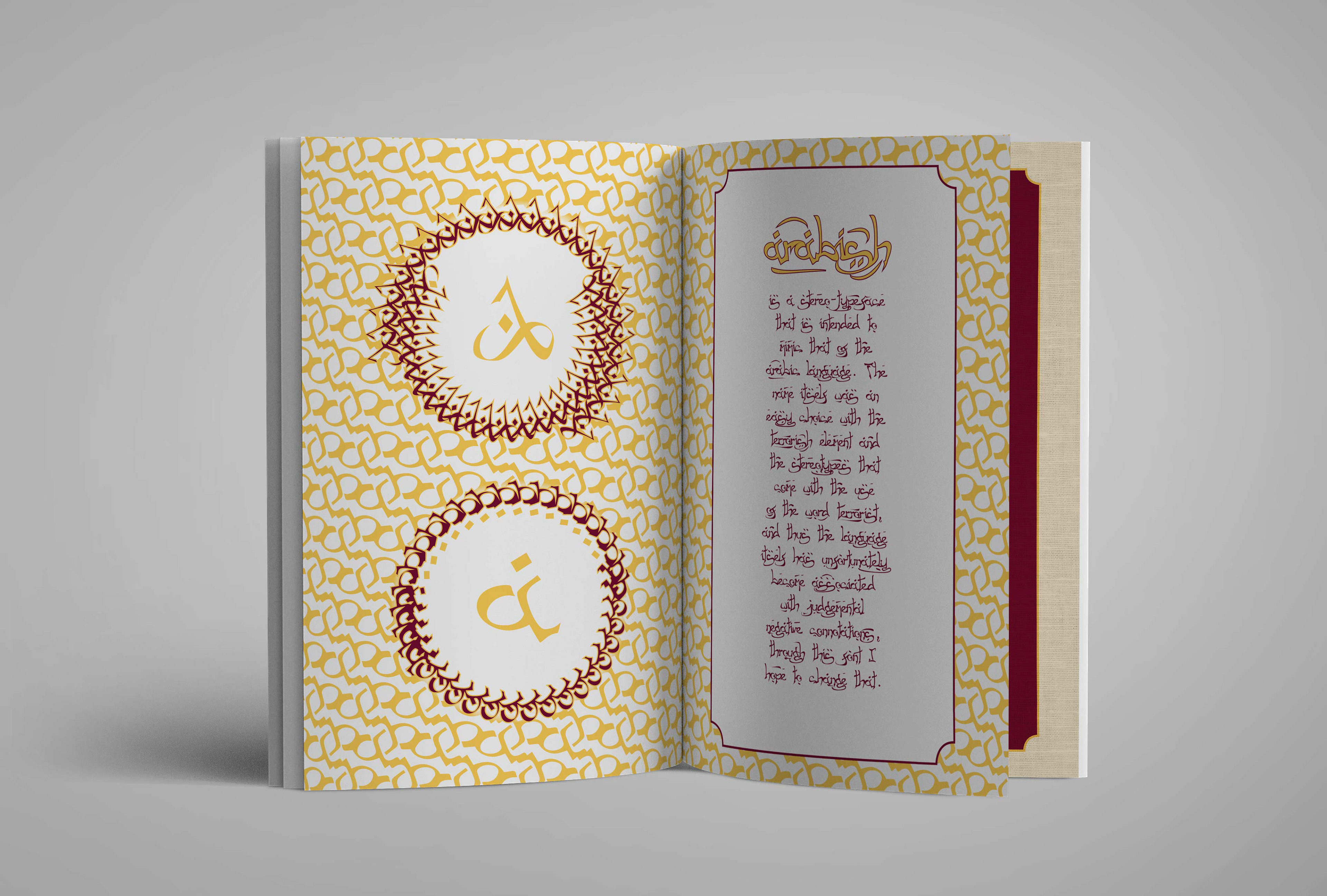
The first spread of the publication, highlighting the A of the alphabet and introducing the premise of the stereo-typeface.
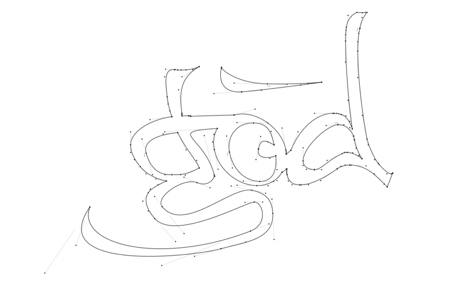
Closer look at the paths and form of some of the ligatrures in FontLab.
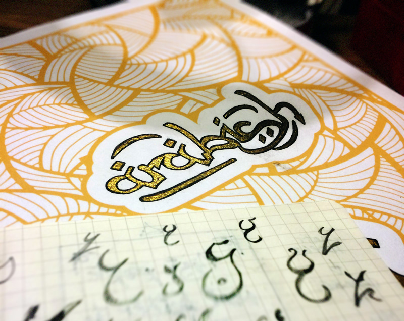
Some gold leaf experiments and glyph exploration.

A pattern made from the lower case 'w'.