Swipe Right.
Rebranding FTW
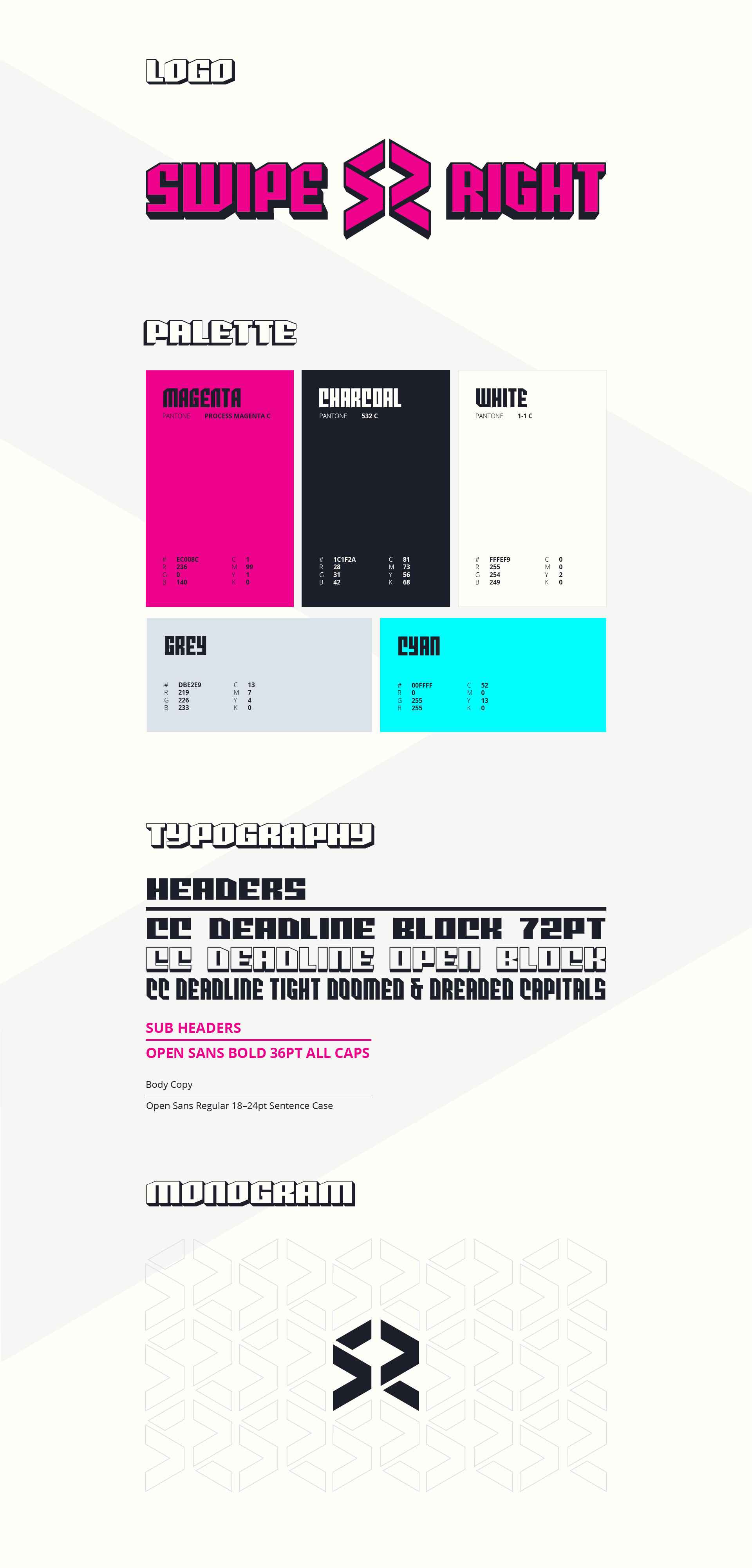
The client desired a redesign of their brand to seamlessly fit in with other prominent eSports sponsors and teams while also being versatile enough to stand out on its own. The ultimate design needed to have a modular structure, with an identifiable isometric monogram featuring rightward arrows, as well as a logotype that remained impactful without the use of any iconography.
Drawing inspiration from the opening credits of the 'Edgerunners' anime by Studio Trigger, I adjusted a variable font family by Comicraft to find the perfect balance between stroke and space. By cutting into the letters, we were able to direct attention towards the monogram. To complete the design, we incorporated a bold colour palette and a complementary font.